Overview
The live site and design system are not 1:1
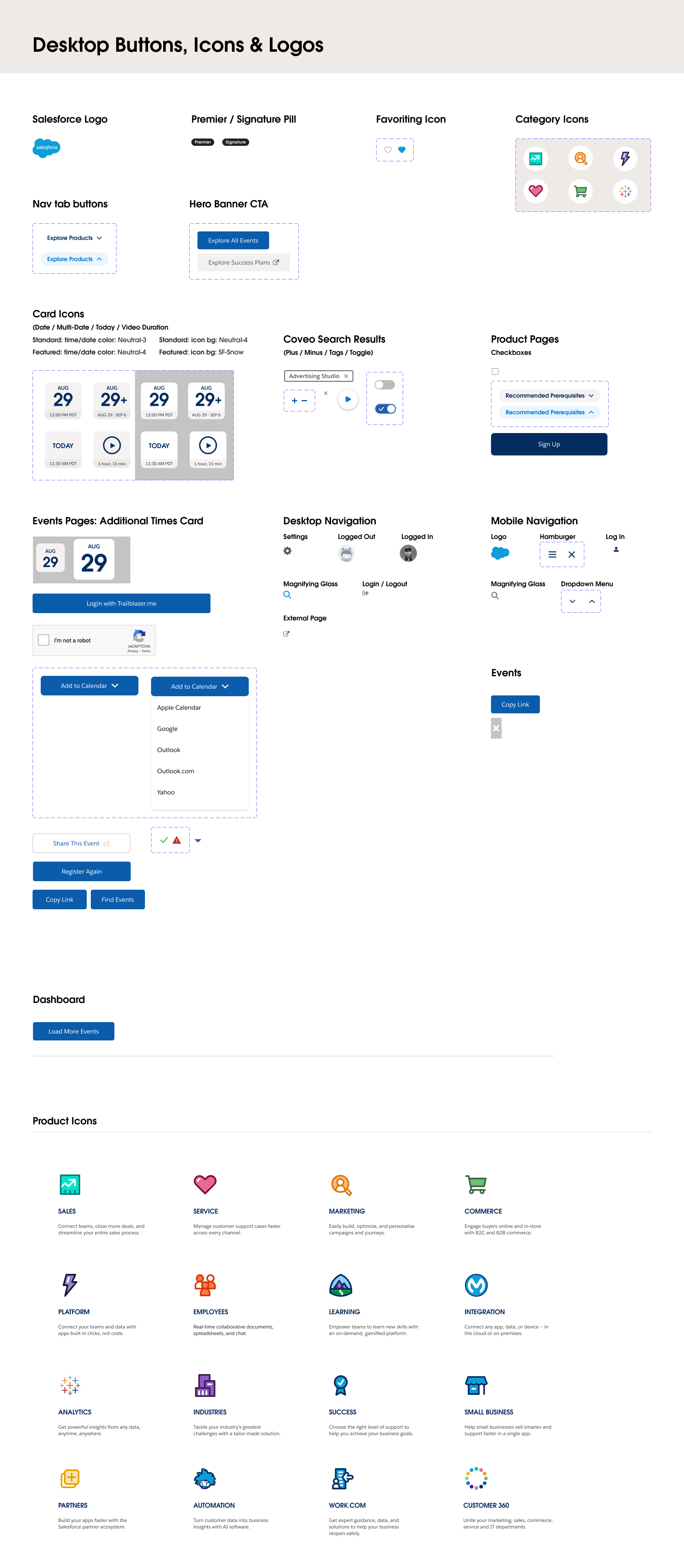
The previous design system did not provide the most recent components being used on the website, causing confusion and errors for the design team.
Additionally, many of the components were not responsive, causing broken and missing design components in the system.
Problem
How can we create a more effective design system that is up-to-date and easy to edit?
To ensure that there wouldn't be problems in the future, the new Salesforce Customer Success design system was revised to reduce confusion and maximize efficiency.
Design Process
Capturing the Live Site
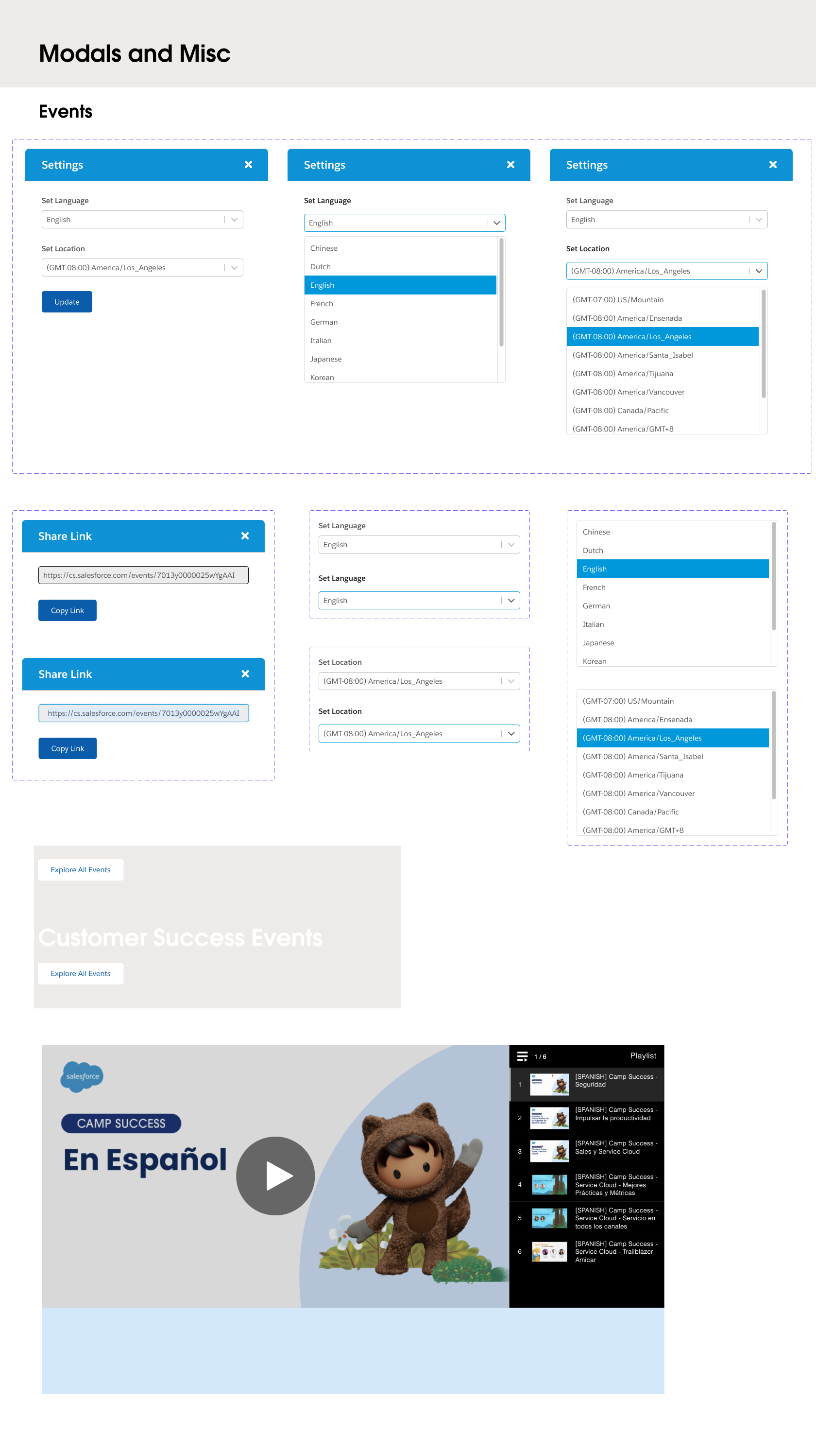
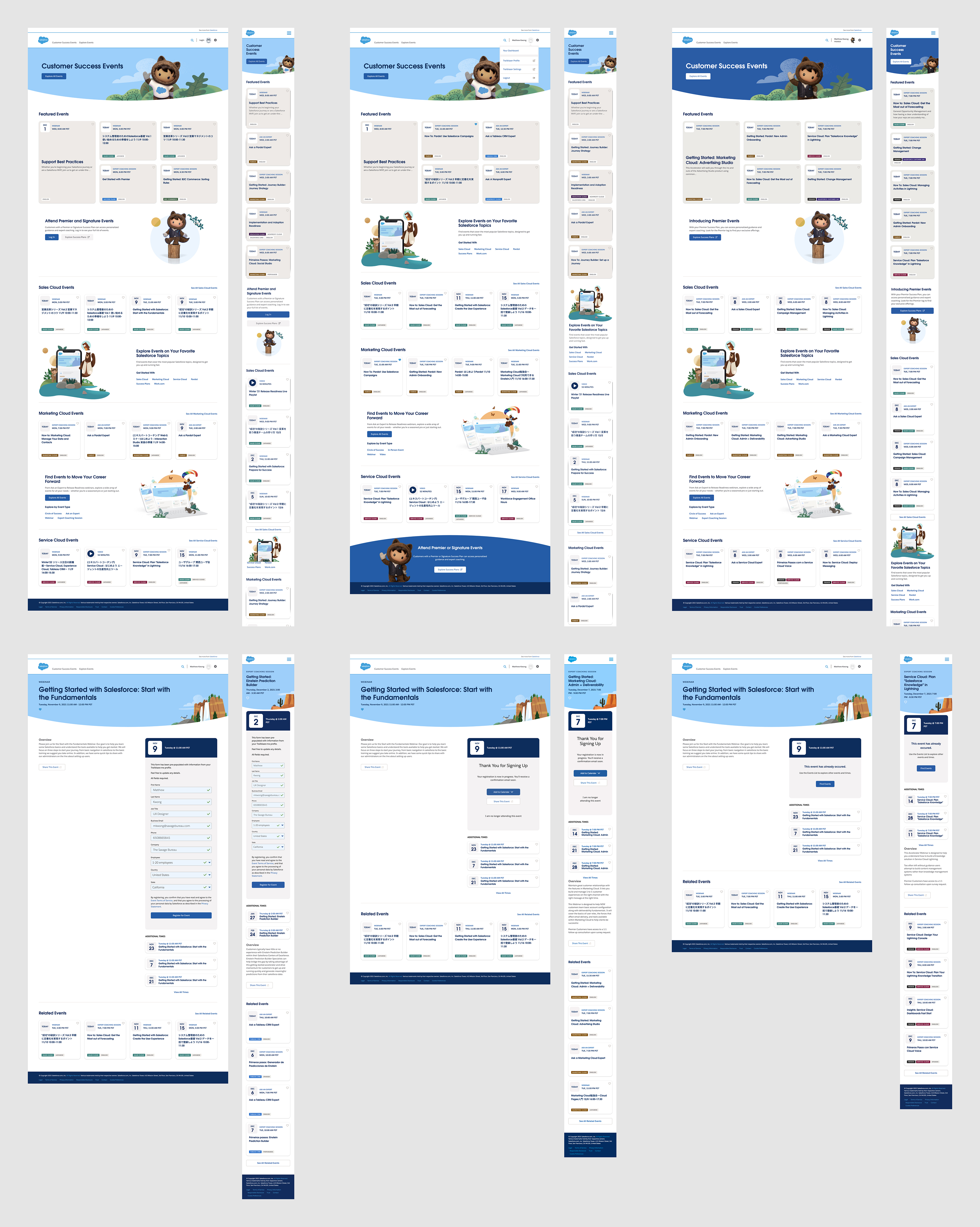
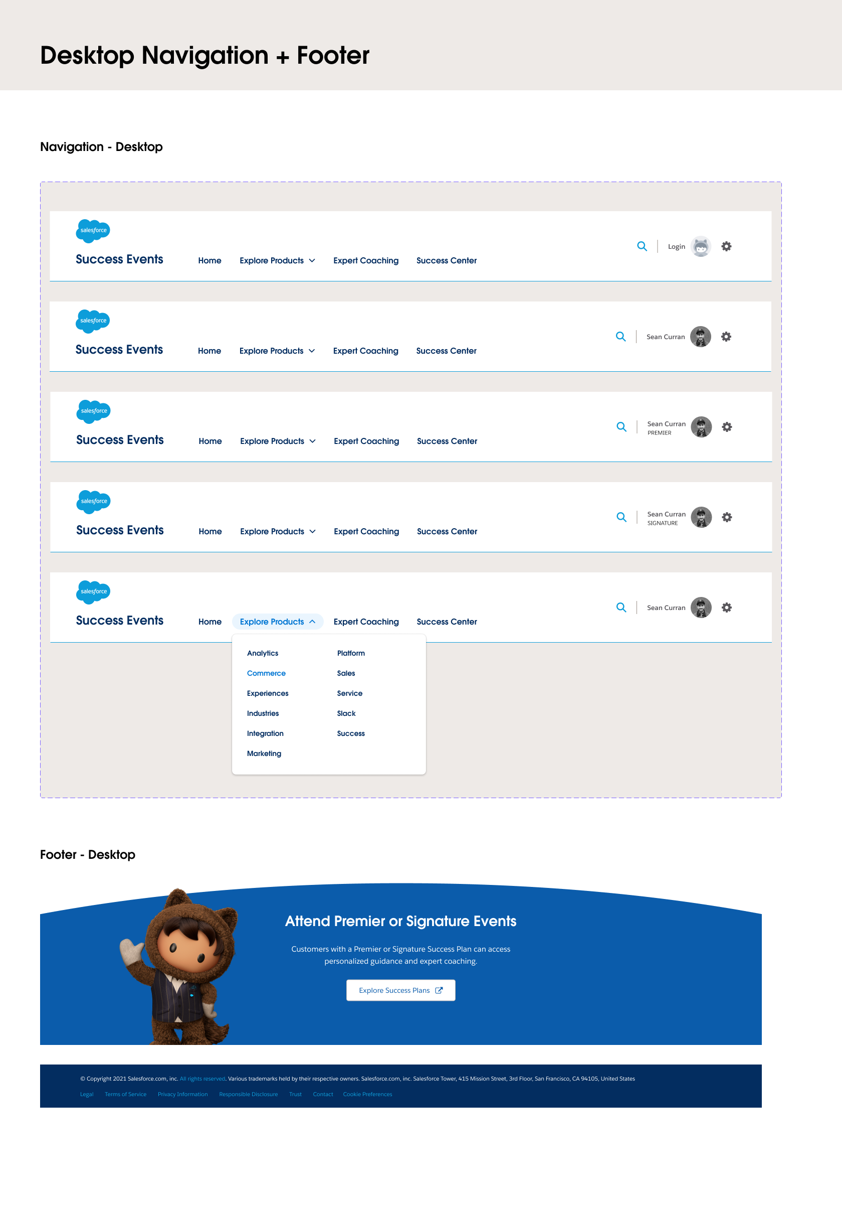
To ensure we were creating the latest and greatest components in our new design system, I screen-captured every existing page type into Figma. This included multiple screen-captures of the different types of page styles if a user was logged-out, logged-in, or a signature/premier member and the entire user flow of registering for an event.
Design Process
Building reliable components
Many existing design components lacked editability and responsiveness that would require the designer to recreate the component entirely.
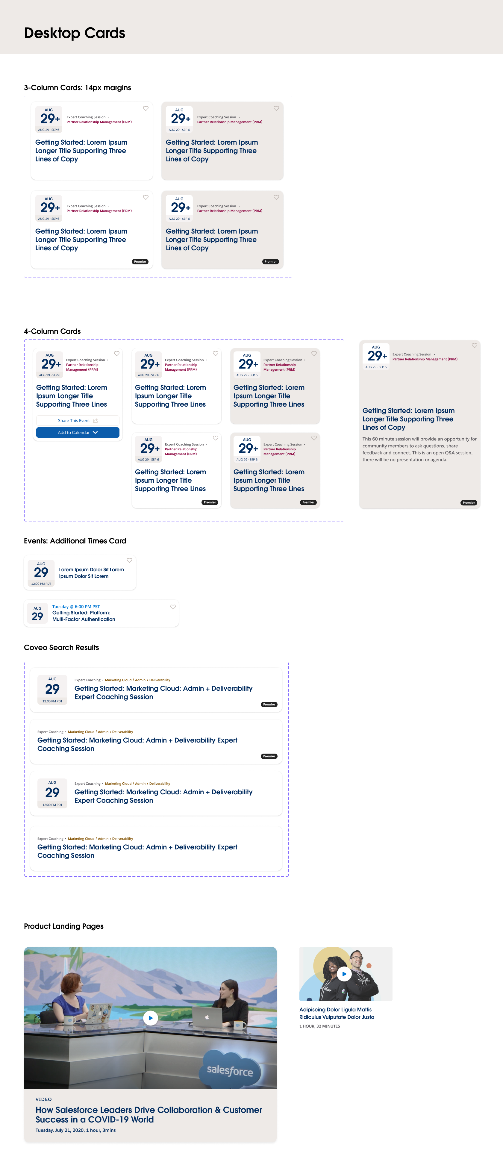
I created efficient components utilizing a combination of Figma's auto-layout, constraints, and variants features. Using these techniques helped create flexible components that were both easy to scale and change.
Additionally, it contains a variety of auto-layout and hug-contents settings that allow for fast text
revisions without breaking the component entirely as everything stays intact and grows accordingly, based on the changes you make.
Design Process
Events Registration Form
A large component feature I worked on was the Events Registration Form. I created a flexible component that allows the data entries to be changed through Figma component variants. Designs for default, invalid, and valid states are all accounted for and can easily be changed with a few clicks.
Challenges
Intimidation is your biggest weakness
The biggest challenge I had while working on this project was the intimidation of tackling this from ground zero.
Other challenges included the tediousness of screen-capturing every page type and its user flow as it required a lot of attention,
making sure I recreated all components that should be accounted for.